GridView GridTile in flutter
A grid view is a graphical control element used to show items in the tabular form. In this section, we are going to learn how to render items in a grid view in the Flutter application
GridView is a widget in Flutter that displays the items in a 2-D array (two-dimensional rows and columns)
It is also referred to as a scrollable 2-D array of widgets.
The grid view can be implemented in various ways, which are given below:
- count()
- builder()
- custom()
- extent()
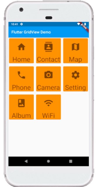
GridView.count()
It is the most frequently used grid layout in Flutter because here, we already know the grid’s size. It allows developers to specify the fixed number of rows and columns. The GriedView.count() contains the following properties:
crossAxisCount: It is used to specify the number of columns in a grid view.
crossAxisSpacing: It is used to specify the number of pixels between each child widget listed in the cross axis.
mainAxisSpacing: It is used to specify the number of pixels between each child widget listed in the main axis.
padding(EdgeInsetsGeometry): It is used to specify the space around the whole list of widgets.
scrollDirection: It is used to specify the direction in which the items on GridView scrolls. By default, it scrolls in a vertical direction.
reverse: If it is true, it will reverse the list in the opposite direction along the main axis.
physics: It is used to determine how the list behaves when the user reaches the end or the start of the widget while scrolling.
shrinkWrap: If it is false, the scrollable list takes more space for scrolling in scroll direction. It is not good because it wastage memory and reduces app performance. Therefore, we will wrap our children widgets using shrinkWrap by setting it to true to avoid memory leakage while scrolling.
Example
- import ‘package:flutter/material.dart’;
- void main() {runApp(MyApp());}
- class MyApp extends StatelessWidget {
- @override
- Widget build(BuildContext context) {
- return MaterialApp(
- home: Scaffold(appBar: AppBar(
- title: Text(“Flutter GridView Demo”),
- ),
- body: GridView.count(
- crossAxisCount: 3,
- crossAxisSpacing: 4.0,
- mainAxisSpacing: 8.0,
- children: List.generate(choices.length, (index) {
- return Center(
- child: SelectCard(choice: choices[index]),
- );
- }
- )
- )
- )
- );
- }
- }
- class Choice {
- const Choice({this.title, this.icon});
- final String title;
- final IconData icon;
- }
- const List<Choice> choices = const <Choice>[
- const Choice(title: ‘Home’, icon: Icons.home),
- const Choice(title: ‘Contact’, icon: Icons.contacts),
- const Choice(title: ‘Map’, icon: Icons.map),
- const Choice(title: ‘Phone’, icon: Icons.phone),
- const Choice(title: ‘Camera’, icon: Icons.camera_alt),
- const Choice(title: ‘Setting’, icon: Icons.settings),
- const Choice(title: ‘Album’, icon: Icons.photo_album),
- const Choice(title: ‘WiFi’, icon: Icons.wifi),
- ];
- class SelectCard extends StatelessWidget {
- const SelectCard({Key key, this.choice}) : super(key: key);
- final Choice choice;
- @override
- Widget build(BuildContext context) {
- final TextStyle textStyle = Theme.of(context).textTheme.display1;
- return Card(
- color: Colors.orange,
- child: Center(child: Column(
- crossAxisAlignment: CrossAxisAlignment.center,
- children: <Widget>[
- Expanded(child: Icon(choice.icon, size:50.0, color: textStyle.color)),
- Text(choice.title, style: textStyle),
- ]
- ),
- )
- );
- }
- }
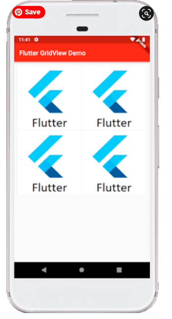
GridView.builder()
This property is used when we want to display data dynamically or on-demand. In other words, if the user wants to create a grid with a large (infinite) number of children, then they can use the GridView.builder() constructor with either a SliverGridDelegateWithFixedCrossAxisCount or a SliverGridDelegateWithMaxCrossAxisExtent.
The common attributes of this widget are:
itemCount: It is used to define the amount of data to be displayed.
Example
- import ‘package:flutter/material.dart’;
- void main() => runApp(MyApp());
- class MyApp extends StatelessWidget {
- List<String> images = [
- “https://static.javatpoint.com/tutorial/flutter/images/flutter-logo.png”,
- “https://static.javatpoint.com/tutorial/flutter/images/flutter-logo.png”,
- “https://static.javatpoint.com/tutorial/flutter/images/flutter-logo.png”,
- “https://static.javatpoint.com/tutorial/flutter/images/flutter-logo.png”
- ];
- @override
- Widget build(BuildContext context) {
- return MaterialApp(
- home: Scaffold(
- appBar: AppBar(
- title: Text(“Flutter GridView Demo”),
- backgroundColor: Colors.red,
- ),
- body: Container(
- padding: EdgeInsets.all(12.0),
- child: GridView.builder(
- itemCount: images.length,
- gridDelegate: SliverGridDelegateWithFixedCrossAxisCount(
- crossAxisCount: 2,
- crossAxisSpacing: 4.0,
- mainAxisSpacing: 4.0
- ),
- itemBuilder: (BuildContext context, int index){
- return Image.network(images[index]);
- },
- )),
- ),
- );
- }
- }
Output
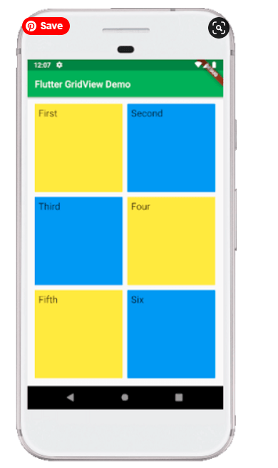
GridView.extent()
This property is used when we want to create a grid with custom extent values. It means each tile has a maximum cross-axis extent.
Example
- import ‘package:flutter/material.dart’;
- void main() => runApp(MyApp());
- class MyApp extends StatelessWidget {
- // This widget is the root of your application.
- @override
- Widget build(BuildContext context) {
- return MaterialApp(
- home: MyGridScreen(),
- );
- }
- }
- class MyGridScreen extends StatefulWidget {
- MyGridScreen({Key key}) : super(key: key);
- @override
- _MyGridScreenState createState() => _MyGridScreenState();
- }
- class _MyGridScreenState extends State<MyGridScreen> {
- @override
- Widget build(BuildContext context) {
- return Scaffold(
- appBar: AppBar(
- title: Text(“Flutter GridView Demo”),
- backgroundColor: Colors.green,
- ),
- body: Center(
- child: GridView.extent(
- primary: false,
- padding: const EdgeInsets.all(16),
- crossAxisSpacing: 10,
- mainAxisSpacing: 10,
- maxCrossAxisExtent: 200.0,
- children: <Widget>[
- Container(
- padding: const EdgeInsets.all(8),
- child: const Text(‘First’, style: TextStyle(fontSize: 20)),
- color: Colors.yellow,
- ),
- Container(
- padding: const EdgeInsets.all(8),
- child: const Text(‘Second’, style: TextStyle(fontSize: 20)),
- color: Colors.blue,
- ),
- Container(
- padding: const EdgeInsets.all(8),
- child: const Text(‘Third’, style: TextStyle(fontSize: 20)),
- color: Colors.blue,
- ),
- Container(
- padding: const EdgeInsets.all(8),
- child: const Text(‘Four’, style: TextStyle(fontSize: 20)),
- color: Colors.yellow,
- ),
- Container(
- padding: const EdgeInsets.all(8),
- child: const Text(‘Fifth’, style: TextStyle(fontSize: 20)),
- color: Colors.yellow,
- ),
- Container(
- padding: const EdgeInsets.all(8),
- child: const Text(‘Six’, style: TextStyle(fontSize: 20)),
- color: Colors.blue,
- ),
- ],
- )),
- );
- }
- }
Output
From Last Lecture
just replace the list view code with the following grid view code with additional decoration