User Interface Design-Software egineering
User Interface Design
Interface Design
Easy to learn ?
Easy to use?
Easy to understand?
Typical Design Errors
- Lack of consistency
- Too much memorization
- No guidance / help
- No context sensitivity
- Poor response
- Unfriendly
Golden Rules
- Place the user in control
- Reduce the user’s memory load
- Make the interface consistent
Place the User in Control
- Provide for flexible interaction.
- Streamline interaction as skill levels advance and allow the interaction to be customized.
- Hide technical internals from the casual user.
- Design for direct interaction with objects that appear on the screen.
Reduce the User’s Memory Load
- Reduce demand on short-term memory.
- Establish meaningful names.
- Define shortcuts.
- The visual layout of the interface should be based on a real world metaphor.
- Disclose information in a progressive fashion.
Make the Interface Consistent
- Allow the user to put the current task into a meaningful context.
- Maintain consistency across a family of applications.
- If past interactive models have created user expectations, do not make changes unless there is a compelling reason to do so.
User Interface Design Models
- User model — a profile of all end users of the system
- Design model — a design realization of the user model
- Mental model (system perception) the user’s mental image of what the interface is
- Implementation model — the interface look and feel coupled with supporting information that describe interface syntax and semantics
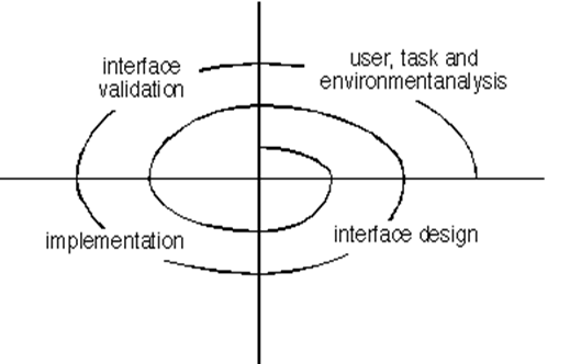
User Interface Design Process

Interface Analysis
Interface analysis means understanding :
- the people (end-users) who will interact with the system through the interface
- the tasks that end-users must perform to do their work,
- the content that is presented as part of the interface
- the environment in which these tasks will be conducted.
- Are users trained professionals, technician, or manufacturing workers?
- What level of formal education does the average user have?
- Are the users capable of learning from written materials or have they expressed a desire for classroom training?
- Are users expert typists or keyboard phobic?
- What is the age range of the user community?
- How are users compensated for the work they perform?
- Do users work normal office hours or do they work until the job is done?
- What is the primary spoken language among users?
- What are the consequences if a user makes a mistake using the system?
- Are users experts in the subject matter that is addressed by the system?
- Do users want to know about the technology the sits behind the interface?
Task Analysis and Modeling
Task Analysis answers the following questions …
- What work will the user perform in specific circumstances?
- What tasks and subtasks will be performed as the user does the work?
- What specific problem domain objects will the user manipulate as work is performed?
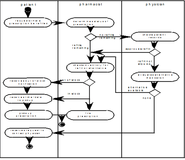
- What is the sequence of work tasks—the workflow?
- Workflow analysis defines how a work process is completed when several people (and roles) are involved
- What is the hierarchy of tasks?
- Use-cases define basic interaction

Analysis of Display Content
- Are different types of data assigned to consistent geographic locations on the screen (e.g., photos always appear in the upper right hand corner)?
- Can the user customize the screen location for content?
- Is proper on-screen identification assigned to all content?
- If a large report is to be presented, how should it be partitioned for ease of understanding?
- Will graphical output be scaled to fit within the bounds of the display device that is used?
- How will color to be used to enhance understanding?
- How will error messages and warning be presented to the user?
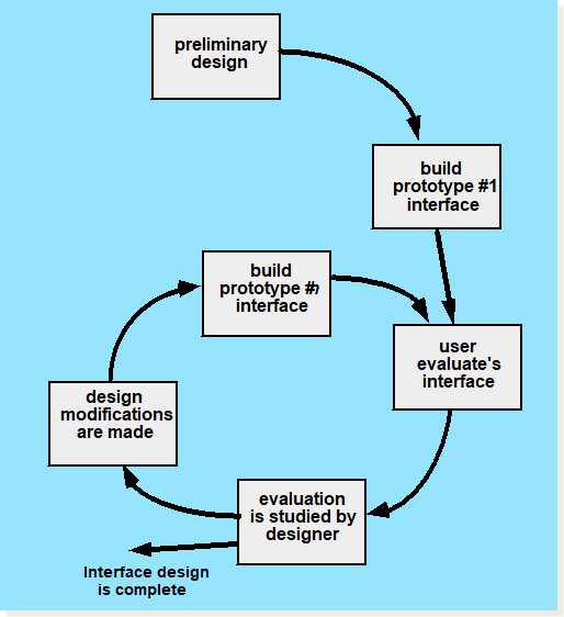
Design Evaluation Cycle

Interface Design Patterns
- Patterns are available for
–The complete UI
–Page layout
–Forms and input
–Tables
–Searching
–Page elements
–e-Commerce
Design Issues
- Response time
- Help facilities
- Error handling
- Menu
- Application accessibility

