Introduction to widgets in flutter and its example
Basic widgets in flutter
Flutter comes with a suite of powerful basic widgets, of which the following are commonly used:
Text- The
Textwidget lets you create a run of styled text within your application. Row,Column- These flex widgets let you create flexible layouts in both the horizontal (
Row) and vertical (Column) directions. The design of these objects is based on the web’s flexbox layout model. Stack- Instead of being linearly oriented (either horizontally or vertically), a
Stackwidget lets you place widgets on top of each other in paint order. You can then use thePositionedwidget on children of aStackto position them relative to the top, right, bottom, or left edge of the stack. Stacks are based on the web’s absolute positioning layout model. Container- The
Containerwidget lets you create a rectangular visual element. A container can be decorated with aBoxDecoration, such as a background, a border, or a shadow. AContainercan also have margins, padding, and constraints applied to its size. In addition, aContainercan be transformed in three dimensional space using a matrix.
Hello world
The minimal Flutter app simply calls the runApp() function with a widget:
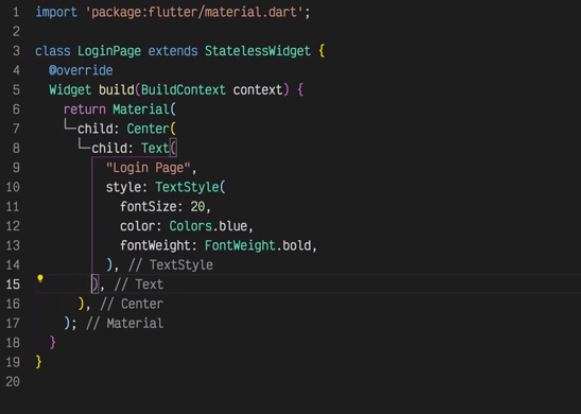
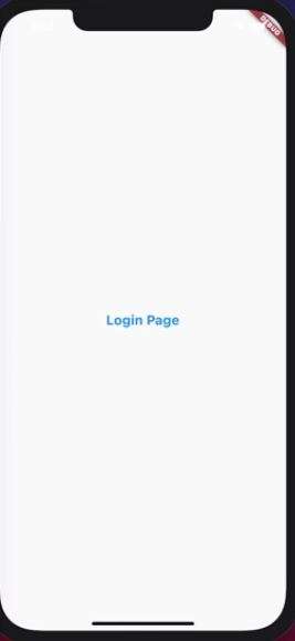
import ‘package:flutter/material.dart’;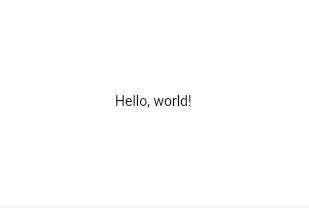
void main() {
runApp(
const Center(
child: Text(
‘Hello, world!’,
textDirection: TextDirection.ltr,
),
),
);
}
Output for the above program is as under
The runApp() function takes the given Widget and makes it the root of the widget tree. In this example, the widget tree consists of two widgets, the Center widget and its child, the Text widget. The framework forces the root widget to cover the screen, which means the text “Hello, world” ends up centered on screen. The text direction needs to be specified in this instance; when the MaterialApp widget is used and will demonstrate later.
When writing an app, you’ll commonly author new widgets that are subclasses of either StatelessWidget or StatefulWidget, depending on whether your widget manages any state. A widget’s main job is to implement a build() function, which describes the widget in terms of other, lower-level widgets. The framework builds those widgets in turn until the process bottoms out in widgets that represent the underlying RenderObject, which computes and describes the geometry of the widget.
Below are some simple widgets that combine these and other widgets:
import ‘package:flutter/material.dart’;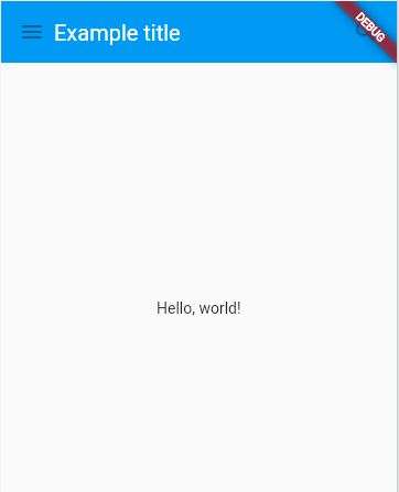
class MyAppBar extends StatelessWidget {
const MyAppBar({required this.title, super.key});
// Fields in a Widget subclass are always marked “final”.
final Widget title;
@override
Widget build(BuildContext context) {
return Container(
height: 56.0, // in logical pixels
padding: const EdgeInsets.symmetric(horizontal: 8.0),
decoration: BoxDecoration(color: Colors.blue[500]),
// Row is a horizontal, linear layout.
child: Row(
children: [
const IconButton(
icon: Icon(Icons.menu),
tooltip: ‘Navigation menu’,
onPressed: null, // null disables the button
),
// Expanded expands its child
// to fill the available space.
Expanded(
child: title,
),
const IconButton(
icon: Icon(Icons.search),
tooltip: ‘Search’,
onPressed: null,
),
],
),
);
}
}
class MyScaffold extends StatelessWidget {
const MyScaffold({super.key});
@override
Widget build(BuildContext context) {
// Material is a conceptual piece
// of paper on which the UI appears.
return Material(
// Column is a vertical, linear layout.
child: Column(
children: [
MyAppBar(
title: Text(
‘Example title’,
style: Theme.of(context) //
.primaryTextTheme
.headline6,
),
),
const Expanded(
child: Center(
child: Text(‘Hello, world!’),
),
),
],
),
);
}
}
void main() {
runApp(
const MaterialApp(
title: ‘My app’, // used by the OS task switcher
home: SafeArea(
child: MyScaffold(),
),
),
);
}
Be sure to have a uses-material-design: true entry in the flutter section of your pubspec.yaml file. It allows you to use the predefined set of Material icons. It’s generally a good idea to include this line if you are using the Materials library.
name: my_app
flutter:
uses-material-design: true
Many Material Design widgets need to be inside of a MaterialApp to display properly, in order to inherit theme data. Therefore, run the application with a MaterialApp.
The MyAppBar widget creates a Container with a height of 56 device-independent pixels with an internal padding of 8 pixels, both on the left and the right. Inside the container, MyAppBar uses a Row layout to organize its children. The middle child, the title widget, is marked as Expanded, which means it expands to fill any remaining available space that hasn’t been consumed by the other children. You can have multiple Expanded children and determine the ratio in which they consume the available space using the flex argument to Expanded.
The MyScaffold widget organizes its children in a vertical column. At the top of the column it places an instance of MyAppBar, passing the app bar a Text widget to use as its title. Passing widgets as arguments to other widgets is a powerful technique that lets you create generic widgets that can be reused in a wide variety of ways. Finally, MyScaffold uses an Expanded to fill the remaining space with its body, which consists of a centered message.
For more information, see Layouts.
Using Material Components
Flutter provides a number of widgets that help you build apps that follow Material Design. A Material app starts with the MaterialApp widget, which builds a number of useful widgets at the root of your app, including a Navigator, which manages a stack of widgets identified by strings, also known as “routes”. The Navigator lets you transition smoothly between screens of your application. Using the MaterialApp widget is entirely optional but a good practice.
import ‘package:flutter/material.dart’;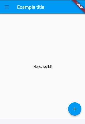
void main() {
runApp(
const MaterialApp(
title: ‘Flutter Tutorial’,
home: TutorialHome(),
),
);
}
class TutorialHome extends StatelessWidget {
const TutorialHome({super.key});
@override
Widget build(BuildContext context) {
// Scaffold is a layout for
// the major Material Components.
return Scaffold(
appBar: AppBar(
leading: const IconButton(
icon: Icon(Icons.menu),
tooltip: ‘Navigation menu’,
onPressed: null,
),
title: const Text(‘Example title’),
actions: const [
IconButton(
icon: Icon(Icons.search),
tooltip: ‘Search’,
onPressed: null,
),
],
),
// body is the majority of the screen.
body: const Center(
child: Text(‘Hello, world!’),
),
floatingActionButton: const FloatingActionButton(
tooltip: ‘Add’, // used by assistive technologies
onPressed: null,
child: Icon(Icons.add),
),
);
}
}
Now that the code has switched from MyAppBar and MyScaffold to the AppBar and Scaffold widgets, and from material.dart, the app is starting to look a bit more Material. For example, the app bar has a shadow and the title text inherits the correct styling automatically. A floating action button is also added.
Notice that widgets are passed as arguments to other widgets. The Scaffold widget takes a number of different widgets as named arguments, each of which are placed in the Scaffold layout in the appropriate place. Similarly, the AppBar widget lets you pass in widgets for the leading widget, and the actions of the title widget. This pattern recurs throughout the framework and is something you might consider when designing your own widgets.
Handling gestures
Most applications include some form of user interaction with the system. The first step in building an interactive application is to detect input gestures. See how that works by creating a simple button:
import ‘package:flutter/material.dart’;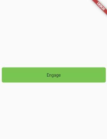
class MyButton extends StatelessWidget {
const MyButton({super.key});
@override
Widget build(BuildContext context) {
return GestureDetector(
onTap: () {
print(‘MyButton was tapped!’);
},
child: Container(
height: 50.0,
padding: const EdgeInsets.all(8.0),
margin: const EdgeInsets.symmetric(horizontal: 8.0),
decoration: BoxDecoration(
borderRadius: BorderRadius.circular(5.0),
color: Colors.lightGreen[500],
),
child: const Center(
child: Text(‘Engage’),
),
),
);
}
}
void main() {
runApp(
const MaterialApp(
home: Scaffold(
body: Center(
child: MyButton(),
),
),
),
);
}
The GestureDetector widget doesn’t have a visual representation but instead detects gestures made by the user. When the user taps the Container, the GestureDetector calls its onTap() callback, in this case printing a message to the console. You can use GestureDetector to detect a variety of input gestures, including taps, drags, and scales.
Many widgets use a GestureDetector to provide optional callbacks for other widgets. For example, the IconButton, ElevatedButton, and FloatingActionButton widgets have onPressed() callbacks that are triggered when the user taps the widget.
Changing widgets in response to input
So far, this page has used only stateless widgets. Stateless widgets receive arguments from their parent widget, which they store in final member variables. When a widget is asked to build(), it uses these stored values to derive new arguments for the widgets it creates.
In order to build more complex experiences—for example, to react in more interesting ways to user input—applications typically carry some state. Flutter uses StatefulWidgets to capture this idea. StatefulWidgets are special widgets that know how to generate State objects, which are then used to hold state. Consider this basic example, using the ElevatedButton mentioned earlier:
import ‘package:flutter/material.dart’;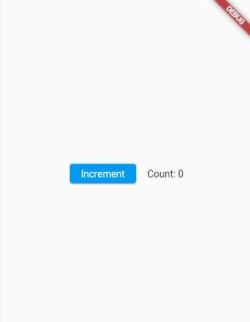
class Counter extends StatefulWidget {
// This class is the configuration for the state.
// It holds the values (in this case nothing) provided
// by the parent and used by the build method of the
// State. Fields in a Widget subclass are always marked
// “final”.
const Counter({super.key});
@override
State<Counter> createState() => _CounterState();
}
class _CounterState extends State<Counter> {
int _counter = 0;
void _increment() {
setState(() {
// This call to setState tells the Flutter framework
// that something has changed in this State, which
// causes it to rerun the build method below so that
// the display can reflect the updated values. If you
// change _counter without calling setState(), then
// the build method won’t be called again, and so
// nothing would appear to happen.
_counter++;
});
}
@override
Widget build(BuildContext context) {
// This method is rerun every time setState is called,
// for instance, as done by the _increment method above.
// The Flutter framework has been optimized to make
// rerunning build methods fast, so that you can just
// rebuild anything that needs updating rather than
// having to individually changes instances of widgets.
return Row(
mainAxisAlignment: MainAxisAlignment.cwenter,
children: <Widget>[
ElevatedButton(
onPressed: _increment,
child: const Text(‘Increment’),
),
const SizedBox(width: 16),
Text(‘Count: $_counter’),
],
);
}
}
void main() {
runApp(
const MaterialApp(
home: Scaffold(
body: Center(
child: Counter(),
),
),
),
);
}
You might wonder why StatefulWidget and State are separate objects. In Flutter, these two types of objects have different life cycles. Widgets are temporary objects, used to construct a presentation of the application in its current state. State objects, on the other hand, are persistent between calls to build(), allowing them to remember information.
The example above accepts user input and directly uses the result in its build() method. In more complex applications, different parts of the widget hierarchy might be responsible for different concerns; for example, one widget might present a complex user interface with the goal of gathering specific information, such as a date or location, while another widget might use that information to change the overall presentation.
In Flutter, change notifications flow “up” the widget hierarchy by way of callbacks, while current state flows “down” to the stateless widgets that do presentation. The common parent that redirects this flow is the State. The following slightly more complex example shows how this works in practice:
import ‘package:flutter/material.dart’;
class CounterDisplay extends StatelessWidget {
const CounterDisplay({required this.count, super.key});
final int count;
@override
Widget build(BuildContext context) {
return Text(‘Count: $count’);
}
}
class CounterIncrementor extends StatelessWidget {
const CounterIncrementor({required this.onPressed, super.key});
final VoidCallback onPressed;
@override
Widget build(BuildContext context) {
return ElevatedButton(
onPressed: onPressed,
child: const Text(‘Increment’),
);
}
}
class Counter extends StatefulWidget {
const Counter({super.key});
@override
State<Counter> createState() => _CounterState();
}
class _CounterState extends State<Counter> {
int _counter = 0;
void _increment() {
setState(() {
++_counter;
});
}
@override
Widget build(BuildContext context) {
return Row(
mainAxisAlignment: MainAxisAlignment.center,
children: <Widget>[
CounterIncrementor(onPressed: _increment),
const SizedBox(width: 16),
CounterDisplay(count: _counter),
],
);
}
}
void main() {
runApp(
const MaterialApp(
home: Scaffold(
body: Center(
child: Counter(),
),
),
),
);
}
Notice the creation of two new stateless widgets, cleanly separating the concerns of displaying the counter (CounterDisplay) and changing the counter (CounterIncrementor). Although the net result is the same as the previous example, the separation of responsibility allows greater complexity to be encapsulated in the individual widgets, while maintaining simplicity in the parent.
For more information, see:
StatefulWidgetsetState()
Bringing it all together
What follows is a more complete example that brings together these concepts: A hypothetical shopping application displays various products offered for sale, and maintains a shopping cart for intended purchases. Start by defining the presentation class, ShoppingListItem:
import ‘package:flutter/material.dart’;
class Product {
const Product({required this.name});
final String name;
}
typedef CartChangedCallback = Function(Product product, bool inCart);
class ShoppingListItem extends StatelessWidget {
ShoppingListItem({
required this.product,
required this.inCart,
required this.onCartChanged,
}) : super(key: ObjectKey(product));
final Product product;
final bool inCart;
final CartChangedCallback onCartChanged;
Color _getColor(BuildContext context) {
// The theme depends on the BuildContext because different
// parts of the tree can have different themes.
// The BuildContext indicates where the build is
// taking place and therefore which theme to use.
return inCart //
? Colors.black54
: Theme.of(context).primaryColor;
}
TextStyle? _getTextStyle(BuildContext context) {
if (!inCart) return null;
return const TextStyle(
color: Colors.black54,
decoration: TextDecoration.lineThrough,
);
}
@override
Widget build(BuildContext context) {
return ListTile(
onTap: () {
onCartChanged(product, inCart);
},
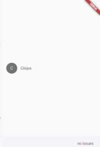
leading: CircleAvatar(
backgroundColor: _getColor(context),
child: Text(product.name[0]),
),
title: Text(product.name, style: _getTextStyle(context)),
);
}
}
void main() {
runApp(
MaterialApp(
home: Scaffold(
body: Center(
child: ShoppingListItem(
product: const Product(name: ‘Chips’),
inCart: true,
onCartChanged: (product, inCart) {},
),
),
),
),
);
}
The ShoppingListItem widget follows a common pattern for stateless widgets. It stores the values it receives in its constructor in final member variables, which it then uses during its build() function. For example, the inCart boolean toggles between two visual appearances: one that uses the primary color from the current theme, and another that uses gray.
When the user taps the list item, the widget doesn’t modify its inCart value directly. Instead, the widget calls the onCartChanged function it received from its parent widget. This pattern lets you store state higher in the widget hierarchy, which causes the state to persist for longer periods of time. In the extreme, the state stored on the widget passed to runApp() persists for the lifetime of the application.
When the parent receives the onCartChanged callback, the parent updates its internal state, which triggers the parent to rebuild and create a new instance of ShoppingListItem with the new inCart value. Although the parent creates a new instance of ShoppingListItem when it rebuilds, that operation is cheap because the framework compares the newly built widgets with the previously built widgets and applies only the differences to the underlying RenderObject.
Here’s an example parent widget that stores mutable state
import ‘package:flutter/material.dart’;
class Product {
const Product({required this.name});
final String name;
}
typedef CartChangedCallback = Function(Product product, bool inCart);
class ShoppingListItem extends StatelessWidget {
ShoppingListItem({
required this.product,
required this.inCart,
required this.onCartChanged,
}) : super(key: ObjectKey(product));
final Product product;
final bool inCart;
final CartChangedCallback onCartChanged;
Color _getColor(BuildContext context) {
// The theme depends on the BuildContext because different
// parts of the tree can have different themes.
// The BuildContext indicates where the build is
// taking place and therefore which theme to use.
return inCart //
? Colors.black54
: Theme.of(context).primaryColor;
}
TextStyle? _getTextStyle(BuildContext context) {
if (!inCart) return null;
return const TextStyle(
color: Colors.black54,
decoration: TextDecoration.lineThrough,
);
}
@override
Widget build(BuildContext context) {
return ListTile(
onTap: () {
onCartChanged(product, inCart);
},
leading: CircleAvatar(
backgroundColor: _getColor(context),
child: Text(product.name[0]),
),
title: Text(
product.name,
style: _getTextStyle(context),
),
);
}
}
class ShoppingList extends StatefulWidget {
const ShoppingList({required this.products, super.key});
final List<Product> products;
// The framework calls createState the first time
// a widget appears at a given location in the tree.
// If the parent rebuilds and uses the same type of
// widget (with the same key), the framework re-uses
// the State object instead of creating a new State object.
@override
State<ShoppingList> createState() => _ShoppingListState();
}
class _ShoppingListState extends State<ShoppingList> {
final _shoppingCart = <Product>{};
void _handleCartChanged(Product product, bool inCart) {
setState(() {
// When a user changes what’s in the cart, you need
// to change _shoppingCart inside a setState call to
// trigger a rebuild.
// The framework then calls build, below,
// which updates the visual appearance of the app.
if (!inCart) {
_shoppingCart.add(product);
} else {
_shoppingCart.remove(product);
}
});
}
@override
Widget build(BuildContext context) {
return Scaffold(
appBar: AppBar(
title: const Text(‘Shopping List’),
),
body: ListView(
padding: const EdgeInsets.symmetric(vertical: 8.0),
children: widget.products.map((product) {
return ShoppingListItem(
product: product,
inCart: _shoppingCart.contains(product),
onCartChanged: _handleCartChanged,
);
}).toList(),
),
);
}
}
void main() {
runApp(const MaterialApp(
title: ‘Shopping App’,
home: ShoppingList(
products: [
Product(name: ‘Eggs’),
Product(name: ‘Flour’),
Product(name: ‘Chocolate chips’),
],
),
));
}

The ShoppingList class extends StatefulWidget, which means this widget stores mutable state. When the ShoppingList widget is first inserted into the tree, the framework calls the createState() function to create a fresh instance of _ShoppingListState to associate with that location in the tree. (Notice that subclasses of State are typically named with leading underscores to indicate that they are private implementation details.) When this widget’s parent rebuilds, the parent creates a new instance of ShoppingList, but the framework reuses the _ShoppingListState instance that is already in the tree rather than calling createState again.
To access properties of the current ShoppingList, the _ShoppingListState can use its widget property. If the parent rebuilds and creates a new ShoppingList, the _ShoppingListState rebuilds with the new widget value. If you wish to be notified when the widget property changes, override the didUpdateWidget() function, which is passed an oldWidget to let you compare the old widget with the current widget.
When handling the onCartChanged callback, the _ShoppingListState mutates its internal state by either adding or removing a product from _shoppingCart. To signal to the framework that it changed its internal state, it wraps those calls in a setState() call. Calling setState marks this widget as dirty and schedules it to be rebuilt the next time your app needs to update the screen. If you forget to call setState when modifying the internal state of a widget, the framework won’t know your widget is dirty and might not call the widget’s build() function, which means the user interface might not update to reflect the changed state. By managing state in this way, you don’t need to write separate code for creating and updating child widgets. Instead, you simply implement the build function, which handles both situations.
Responding to widget lifecycle events
After calling createState() on the StatefulWidget, the framework inserts the new state object into the tree and then calls initState() on the state object. A subclass of State can override initState to do work that needs to happen just once. For example, override initState to configure animations or to subscribe to platform services. Implementations of initState are required to start by calling super.initState.
When a state object is no longer needed, the framework calls dispose() on the state object. Override the dispose function to do cleanup work. For example, override dispose to cancel timers or to unsubscribe from platform services. Implementations of dispose typically end by calling super.dispose.
For more information, see State.
Keys
Use keys to control which widgets the framework matches up with other widgets when a widget rebuilds. By default, the framework matches widgets in the current and previous build according to their runtimeType and the order in which they appear. With keys, the framework requires that the two widgets have the same key as well as the same runtimeType.
Keys are most useful in widgets that build many instances of the same type of widget. For example, the ShoppingList widget, which builds just enough ShoppingListItem instances to fill its visible region:
- Without keys, the first entry in the current build would always sync with the first entry in the previous build, even if, semantically, the first entry in the list just scrolled off screen and is no longer visible in the viewport.
- By assigning each entry in the list a “semantic” key, the infinite list can be more efficient because the framework syncs entries with matching semantic keys and therefore similar (or identical) visual appearances. Moreover, syncing the entries semantically means that state retained in stateful child widgets remains attached to the same semantic entry rather than the entry in the same numerical position in the viewport.
For more information, see the Key API.
Global keys
Use global keys to uniquely identify child widgets. Global keys must be globally unique across the entire widget hierarchy, unlike local keys which need only be unique among siblings. Because they are globally unique, a global key can be used to retrieve the state associated with a widget.
For more information, see the GlobalKey API.
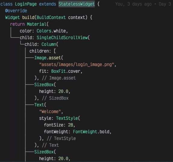
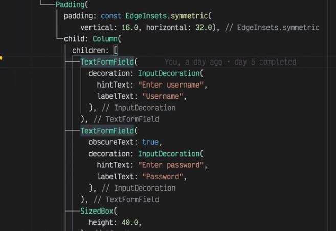
Some Basic Example
Function class and text etc
Class and Text Example
Function Example
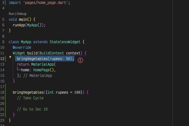
Material App example
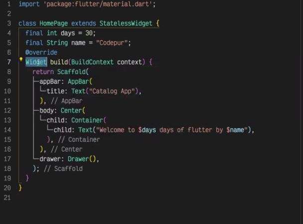

State Less
State full