Redesigning Interfaces
The purpose of this lab is to help students redesign the software interfaces discussed in the previous lab session.
The expected outcome of this lab activity is the student’s ability to:
- Assess a software interface design in general
- Redesign (draw) software interface after identifying the problems
Activity 1
Recalling the discussion (about the homepage, Figure 2.1) done in the previous lab, the task is to redraw this page. The main problem with the given interface is that too many things are crammed into a little space. This makes it very hard to read and understand.
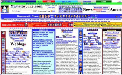
Figure 2.1: Homepage of Havenworks.com
The key design consideration must be to have clutter-free interfaces for better usability.
Activity 2
Redesign the desktop application (discussed in the previous lab session, Figure 2.2) in which you can select a certificate template and then print it. The main problem with this design is to scroll and no indication is given that how many total designs are present. After choosing a particular design, it is very difficult to choose the same design again.
`
Figure 2.2: Desktop Application for Certificate Printing
There are many possible ways to get a better design. One possibility is to have thumbnails that show the different templates at the same time and we can directly click on one of the templates to choose it. Reselecting the same design a second time then becomes trivial.
Activity 3
We discussed the checkout steps of Dominos’s website in the previous lab session. Just as a reminder please go through the checkout steps again (Figure 2.3 to 2.6) and improve the design
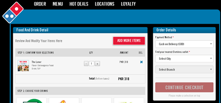
Figure 2.3: Checkout Page
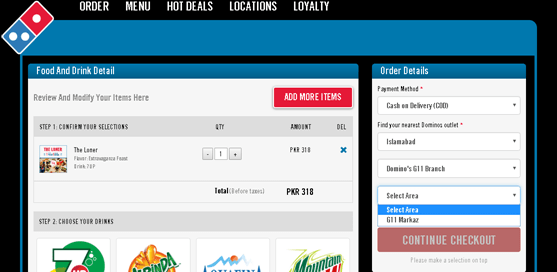
Figure 2.4: City and Branch Option
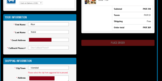
Figure 2.5: Contact Information Option
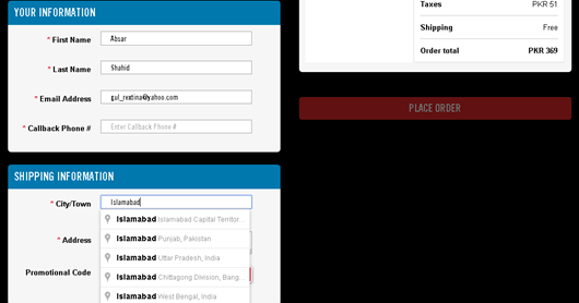
Figure 2.6: Shipping Information
The main flaw in this design is that it keeps asking for the same information again and again. A regular user who has registered would like to be able to order a pizza in a minimum number of steps.
In Figure 2.4, the user is asked to again enter the city and branch which is redundant as the user is already registered. However, in order to give the user flexibility in case they want to order from another city, the default city and branch can be already selected but the user can change them if required. Similarly, in Figure 2.5, after choosing a particular branch, another dropdown menu appears to choose an area and there is only one option. This dropdown menu can be removed completely.
In Figure 2.6, it is required to re-enter the phone number. This can be again filled in with the saved phone number with the option to change it if there is a need. Finally, the last dropdown menu does not even look like such a menu and a user may not even be aware that it needs to be edited before he can proceed to check out. The dropdown menu should give a strong visual cue and there is no need to ask for the city again.
Activity 4
Figure 1.7 shows another example of shopping cart contents and checkout options that we discussed in the previous lab session. Redraw this interface by addressing the existing issues.

Figure 2.7: Shopping Cart Contents There are multiple problems as follows:
- Red is used both for help messages and for error messages
- “There is a problem with your order”, but no explanation or suggestions for resolution
- No “Continue shopping” button
- Recalculate is very close to Clear Cart
- The “Check Out” button doesn’t look like other buttons
- Must recall and type in cart title to load
To redesign this interface, we can address the issues as follows:
- To resolve the first problem, we can use any other color except for red to show the normal messages and use red only for error
- To solve the second problem, we can give a more descriptive error message to clearly explain to the user what the problem
- We can introduce another button that allows a user to return to the main shopping
- The clear cart button should be placed separately to prevent users from accidentally clicking on it. Even then we should ask for confirmation from the user before clearing the
- Check out button should look the same as any other button on the web page to resolve the consistency issue
- We can introduce a drop-down menu that has the names of all the previously stored carts to help the user recognize the name of the cart instead of asking them to recall the name which is more difficult.
Tools:
We will use “Adobe XD” to redesign/develop UI/UX.
Home Activities
Redesign (draw) the interfaces of two systems selected in the last lab session (assignment) to improve their design.
Assignment Deliverables
Students need to submit the following:
- Sketches (redesign interfaces) of both systems