Interface Design Assessment
The purpose of this lab is to introduce students with the basics of software interface designing.
The expected outcome of this lab activity is students’ ability to:
- Critically look at interface design of any system
- Identify problems in system interface design
- Differentiate between good and bad interface design
Introduction
There are various aspects of a good design ranging from look and feel to the desired functionality. We often experience the interaction of different applications; some of those seem quite good whereas it is not the case for all applications. The following activities help us to think about and assess interface designs in general.
Activity 1
The following homepage (Figure 1.1) is an example of bad design. Think about the reasons why it is not considered to be a good design. Discuss the given design in detail and discuss what is wrong with it.
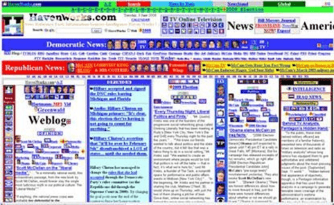
Figure 1.1: Homepage of Havenworks.com
Activity 2
Figure 1.2 is a screenshot of a desktop application in which you can select a certificate template and then print it. To select a template, you go through the scroll bar and then choose the template that you like. Discuss if this is a good design, if not what are some of the main problems with the design. Think about a situation where you like a design and print one certificate and then later you come back to print the same certificate. How easy or difficult would it be to re select the same design that you have already chosen before.

Figure 1.2: Desktop Application for Certificate Printing
Activity 3
The following screenshots (Figure 1.3 to 1.6) of Dominos website are related to placing order followed by the checkout. Please note that a registered customer (of the website) is performing this task.
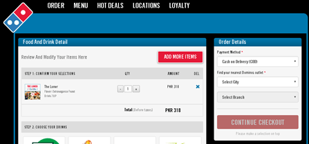
Figure 1.3: Checkout Page
After choosing the city and branch, it displaces the further option (Figure 1.4).
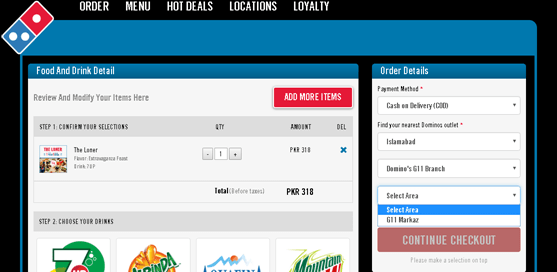
Figure 1.4: City and Branch Option
On the next step, the user is asked for the further contact information (Figure 1.5).
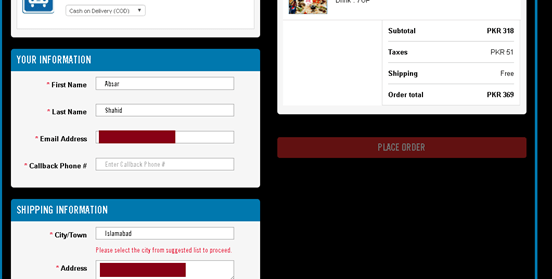
Figure 1.5: Contact Information Option
Address and e-mail address are already filled in. But the user must enter his phone number. Further in city/town, even though Islamabad is already selected but it is not a valid selection, the user must click on it to reveal a drop down menu as shown below (Figure 1.6).
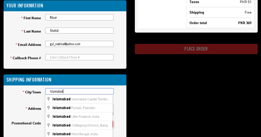
Figure 1.6: Shipping Information
Activity 4
Figure 1.7 shows another example of shopping cart contents and checkout option. Do you think this is a good interface? Identify and discuss the issues that you see in this interface

Figure 1.7: Shopping Cart Contents
More Examples:


Home Activities
Select any two systems (software/website/mobile) which are bad design in your opinion. Discuss in detail why you have chosen them to be examples of bad design.
Assignment Deliverables
Students need to submit a report containing the following:
- Brief description of the chosen systems
- Key problems identified for each system